
AI Home Color Palette and Paint Picker: Choose Colors You’ll Love
An AI home color palette and paint picker turns a single room photo into a coordinated set of wall, trim, and accent colors in seconds. Instead of guessing from a tiny paint fan, tools like home designs ai read the lighting and objects in a room and propose a ready palette you can preview on the walls immediately, similar to how the Sherwin-Williams Color Expert reads a room to suggest complementary shades.

Color is the cheapest material in a renovation and, at the same time, one of the riskiest decisions — an undertone mistake only becomes visible once the wall is already covered. An AI paint picker removes much of that risk by showing the result before a single can of paint is purchased.
What an AI Home Color Palette and Paint Picker Actually Does
Most tools follow the same underlying logic: analyze the photo, isolate surfaces, and simulate paint on top of them. The output is a repaintable rendering plus a downloadable palette, not just a single suggested color.
From photo to palette
The tool detects walls, ceiling, floor, and furniture in the uploaded photo, estimates the room’s lighting, and proposes a coordinated color palette rather than one isolated shade. Users typically choose which zone to repaint — walls only, walls and ceiling, or the entire room — and then pick either a curated palette or a specific HEX code. Many platforms ship with 10 or more curated sets, each built around a tested combination rather than a single trending color, such as:
- Modern Elegance
- Cozy Warmth
- Coastal Blues
- Sage Serenity
- Charcoal Chic
Palette vs single color
There’s a real difference between picking one wall color and generating a full palette. A single-color tool answers «what shade goes on this wall.» A palette generator goes further: it locks in a dominant tone, a secondary tone, and an accent so the three work together automatically. That coordination — not the color-matching itself — is the actual value an AI paint color visualizer adds over a manual paint fan deck.
Color Theory the AI Uses Under the Hood
Behind the interface, an AI paint color visualizer is applying the same principles an interior designer would use by hand, just at a much faster pace.
The color wheel and the 60-30-10 rule
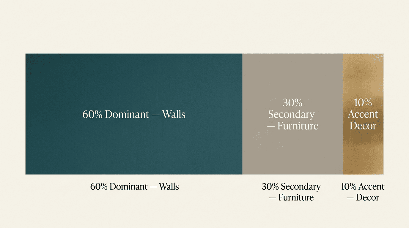
The basis of almost any workable palette is the 60-30-10 rule:
- 60% dominant color — usually the walls
- 30% secondary color — furniture, curtains, rugs
- 10% accent color — decor, pillows, art
Complementary and analogous relationships pulled from the color wheel are what most AI palette generators are implicitly applying when they pair a wall tone with a trim and accent color.
Undertone and LRV — why the same gray looks different
Light Reflectance Value (LRV) measures the percentage of light a paint color reflects, on a scale from 0 (black, absorbs nearly everything) to 100 (white, reflects nearly everything); every 10-point jump reads as a visibly different level of brightness. A living room under typical daylight usually looks best with an LRV between 55 and 75, and anything at 60 or above tends to make a small room feel visually larger. Undertone is a separate variable — it’s the direction a color leans, so a «gray» paint might actually carry a blue, green, or violet cast depending on the base pigments used. In practice, undertone causes more disappointing repaints than lightness does, because two paints with the same LRV can still clash under different bulbs.
How to Use an AI Paint Picker Step by Step
The workflow is short enough to finish in one sitting, and most of the accuracy problems people run into trace back to skipping one of these steps.
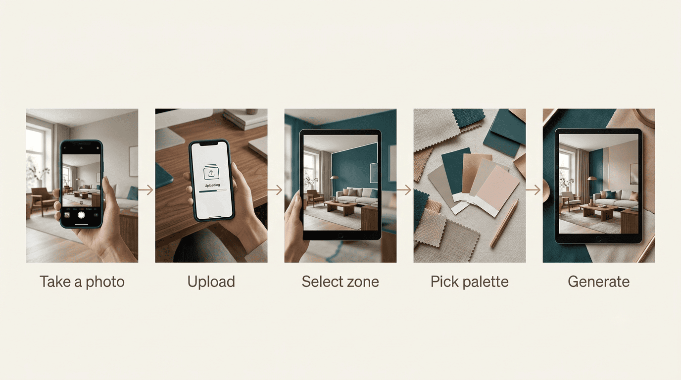
The five-step flow
- Take a photo of the room in daylight, avoiding harsh overhead lighting or direct sun glare.
- Upload the photo to an AI paint picker.
- Select the zone to repaint — walls only, walls plus ceiling, or the full room.
- Choose a curated palette or enter a specific HEX code.
- Generate the render, download it in high resolution, and compare two or three variants side by side.
Some visualizers cap uploads around 50MB, so a compressed phone photo usually clears the limit without extra editing.
Getting a usable result
A few habits make the output far more reliable:
- Shoot with even, natural light and avoid windows blowing out the frame
- Test two or three palettes rather than committing to the first render
- Judge each color across a large wall area in the render, not on a thumbnail-sized swatch
- Re-check the render at a different time of day if the first shot was taken under artificial light
Color perception shifts with the size of the surface it’s viewed on, which is why the same HEX code can look convincing on a full wall and washed out on a tiny swatch.
Palettes That Work Room by Room
The same palette rarely suits every room in a house, because light, function, and mood differ from space to space.
Bedrooms lean toward calm. Muted warm tones and greige shades read as restful and work well with lower LRVs, since bedrooms don’t need the brightness a kitchen does.
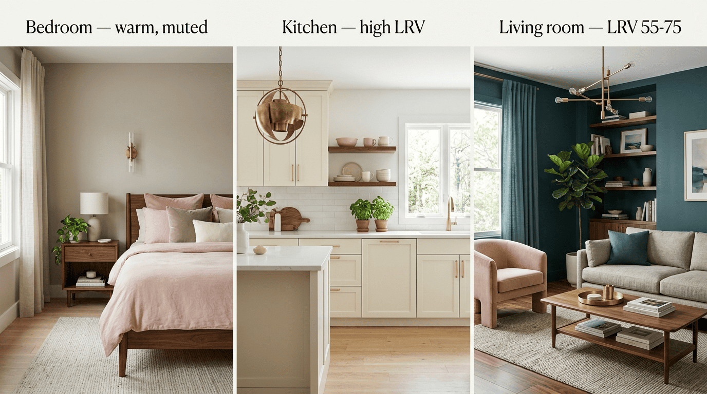
Kitchens favor light and high LRV. Shades at LRV 60 and above read as clean and make the space feel larger under task lighting, which is why white and pale neutral kitchens remain a common AI-generated recommendation. Warmer accent tones still show up here for a reason:
Red also inspires appetite, so it’s a logical choice for your dining room or kitchen.
Sue Wadden, Director of Color Marketing, Sherwin-Williams
An AI palette generator applies the same logic automatically, offering a warm accent alongside a light dominant tone rather than leaving the kitchen entirely neutral.
Living rooms sit in the middle. An LRV around 55-75 balances warmth with enough brightness for a shared, multi-use space.
Window orientation shifts undertone. A north-facing room reads cooler and can wash out a warm undertone, while a south-facing room amplifies warmth — the same HEX code can look noticeably different depending on which way the windows face.
Putting the room-by-room guidance side by side makes the pattern easier to apply when a palette generator returns several options at once:
| Room | Typical LRV target | Undertone priority |
|---|---|---|
| Bedroom | Lower to mid-range | Warm, muted |
| Kitchen | 60+ | Neutral to warm accent |
| Living room | 55-75 | Balanced, light-dependent |
| Small or dark room | 60+ | Matched to bulb temperature |
Small and dark rooms
Rooms with limited natural light generally do better with an LRV of 60 or higher, since higher reflectance helps compensate for the missing daylight. The instinct to «fix» a dark room with plain white often backfires — what actually matters more is choosing the right undertone for the room’s artificial lighting, since a cool white under warm bulbs can look dull rather than bright.
Accuracy, Limits, and Turning Pixels into Real Paint
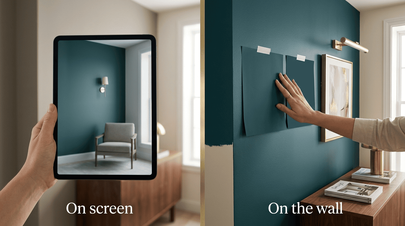
An AI-generated render is a strong starting point, not a final answer — the gap between a screen and a physical wall is the single biggest source of disappointment with these tools.
Why the screen isn’t the wall
A few things distort color between the render and the real wall:
- Monitor calibration and color profile
- Screen brightness and ambient glare on the display
- The device used to view the render — phone, laptop, or tablet
- Compression applied when the render is downloaded or shared
An AI rendering should be treated as a direction to explore, not an exact paint specification. The only reliable way to confirm a color is to test it physically on the actual wall, checking it in both morning and evening light before committing.
Matching AI colors to real paint
| Step | What to do |
|---|---|
| 1. Export the HEX | Pull the exact HEX code from the AI palette or visualizer |
| 2. Find the closest brand match | Compare it against color libraries from major brands |
| 3. Order a physical sample | Request Peel & Stick samples or free color chips |
| 4. Paint a test patch | Apply the sample directly to the wall, not just a card |
| 5. Check under different light | View the patch morning, midday, and evening |
Comparing an AI Home Color Palette against real paint brands means matching the exported HEX code to the closest official color in libraries from Sherwin-Williams, Benjamin Moore, and PPG, then ordering a Peel & Stick sample or a free color chip before buying a full can. Most major brands offer free color chips, which makes this step essentially free insurance against a costly repaint.